Tuesday, November 7, 2017

Keyboard review : K-Type (with Halo True switches!)


Carelessly placed in a way where anyone walking by could take it, my long awaited K-Type keyboard arrived from Massdrop. Fortunately I was first to notice it laying there next to my mailbox, and I quickly took it inside an unboxed it. I have used it to type this review.

So...what's it like then? Well, read on!

KType vs the Model M


I need to start off by explaining a little of my personal keyboard preferences, as we all seem to be different in this regard, if the key switch industry is any guide on this. Perhaps the best way to explain this is to tell you which keyboards I have been using for the last, oh, 10 or more years. At work I use an IBM Model M with the famous original clicky keys. At home I use an ... IBM Model M. You may see a pattern there. So yes, I come from a world of extremely noisy buckling springs and keyboards you could possibly land a small aircraft on. I wrote a review of the keyboard once, but that was back in the day before blogger and it is in raw HTML and the web site that hosted it is long since dead. I might dig it up an put it on here just for kicks (done!)... but I'm being distracted! This is not about the Model M, the best keyboard ever, it is about the K-Type! Is this the new best-est keyboard ever?

Even still, I needed to get that off my chest, and some of you may be wondering how the keyboard switches feel compared to the buckling springs. Well, they are not the same, so there is that, but I will talk more on that point in a bit. I was drawn to the k-type mainly because of these new switches. I have tried all of the modern cherry switches and the blues come closest but none really feel like, or are as good as, the buckling springs. This is totally my opinion, you understand, and yours may be completely different...and wrong! Haha.
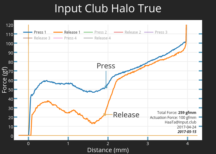
Halo Switches


The K-Type could be ordered with a number of switches installed, and a key feature of the keyboard is that the switches can even be easily changed. Reading more about this I came across some fairly fascinating (to me) charts showing the pressure graphs needed to actuate and release the keys of various key switch types. Included in the chart were all the cherry switches and the topre and buckling spring and some others. I would embed the image, but it seems to be on an insecure site so it complains here on blogger, but you can see it by clicking here.

The guys over at the input club were developing a new kind of switch, which in theory had the best characteristics of all the switches they ever found. They had two new versions, the Halo True and Halo Clears. The pressure chart for the Halo Trues looked interesting to me in that there was a dip in the chart like a soft "click" that the buckling springs have, and then a gentle ramp so that bottoming the keys out was not harsh. I'm not a heavy handed typist anyway, some people really bash away at the keys but I am more gentle so the bottoming out issue is not that critical - but it is part of the key switch experience for sure. The long term effect of a hard landing on your keys is fatigue and possibly joint pain, so it is good to get it right. The activation force is less at 60g vs 70g for the M, and the "click" overall is less pronounced.


I read all the marketing materials and early prototype reviews I could, but it was too new and nobody really compared the new Halo switches directly to buckling springs, or even to the Cherrys in any great detail. So, in a fairly uncharacteristic move I just went out on a limb and ordered the keyboard from Massdrop, my first ever purchase from them. I was one of around 3000 in the drop, a pretty big one I understand, and my keyboard is serial number 968 for what it is worth. It was not cheap, at $217 USD, but it's not like I buy keyboards often. Despite my love for the Model M I wanted to play with some modern features like n-key rollover and backlighting/underlighting and a native USB-C connection and the smaller form factor. I'm still not sure I can live without the numeric keypad, but it sure makes a hell of a difference to the size of the keyboard - it is tiny compared to the M, and allows the mouse to sit closer to you.

Massdrop vs Input Club


There was/is some, um, "controversy" between the Input Club and Massdrop over the ownership of these new Halo switches during development. It looked like it might get ugly but the boards were still shipped on time, in fact a few days early. I'm not really going to comment on the whole deal other than it is a bit sad to watch from the outside and it may mean that you will not be able to buy another K-Type any time soon, or possibly even these switches. We shall see how things pan out. It may be that the Input Club actually develop a different switch and the Halo switch ends up a footnote in keyboard history - in which case I am probably lucky to pick one up when I did. Massdrop currently has around 1700 requests for this product (people who missed the drop), so that is I would have thought enough to go a second one but they have not done so yet - so what does that tell us? Perhaps they are waiting to see how this batch goes, and the reviews, before committing further, but that is all complete guesswork on my part. Moving on.

Packaging and Quality control


The packaging it comes in is nice enough, in a kind-of Apple style. I don't really care about packaging myself, after all in a few moments it is put aside. It came with a fairly usable key puller which has a hidden Phillips head screwdriver in the handle, or perhaps that is like the top of a keyswitch? I'm not really sure what it is! It also came with a switch puller, which is a simple folded piece of metal with hooks on the end. If you ever do take the switches out of the keyboard, it is a very good idea to use this tool and there is also a specific technique to it. There is the USB-C cable included, with the older standard rectangle USB end to plug it into your computer. This is white plastic, and is fine without being anything special really and it is not terribly long. It could easily be replaced if you care.

My example of the keyboard is pretty impressive, I have to say. Solid. I like the look overall myself, it is clean without being too flashy. With the backlighting options and ability to change key caps you can make it look any way you want, more or less. However, a co-worker took one look at it and said "it's ugly, eh!" so opinions do vary. I don't think she liked the exposed key look, or perhaps it was the silver base, she didn't say.

Reading some of the comments of those who got their boards though, it seems that the QA on the manufacture was all over the shop. People have been complaining of duplicate keycaps, non functioning keys, repeated keys, missing magnets, unstable boards, dents/scratches and other issues. More issues that I think you should have in a short run of product. Checking my board over I could see that I had all the right keys, and they all worked as expected and no dents or scratches. The only oddity I had was that some of the keys looked like they had some red marks on them - ink or nail polish or lipstick or ...blood perhaps? I don't know what really, and it gave me an excuse to use the new caps puller to get them off and wash them. The red stuff mostly came off, but there is a small trace of it still there. You can see it on the "( 9" and "{ [" key. Click on the picture to see more detail.


Edit 2017-11-10 : Hmmm. Last night I noticed for SURE that it was dropping letters. I saw this when I was signing off on an email, and typing my name. Instead of "Saul", I got "Sul", yet I typed the "a" - four key presses. I opened up notepad and typed my name many times, and yes, it was dropping letters at random, notably vowels, sometimes the "u" went instead of the "a". It was worse when done quickly, but sometimes even dropped the letters when typing reasonably slowly. I read of someone else who had this issue so I flashed the keyboard once more, making minor tweaks to the colours (kill the yellow and make it all blue) and the problem was then resolved. However, I had flashed the board not long ago and this behaviour is quite alarming. The sole purpose of the keyboard is to capture key presses and if it can't do this reliably then it is simply junk. If this happens frequently it will be the end of this keyboard. I wonder if pulling the USB out and resetting the board may have fixed it too, if it happens again I will try that. Right now, on typing this, I have not had any mistakes, but the letters are sometimes lagging the typing - which may be Blogger or the PC and not the keyboard. Anyway, in hindsight, I wonder if the high number of "mistakes" I was having was due to the keyboard actually dropping letters, although mostly I have been having transposition errors (letters in the wrong places) so it is probably still just me...

Lighting & Software


When you first plug it in the LED's are in a rainbow animation, which is great for seeing that all of them are working properly but not great after a while as it is distracting to type on. And here is were there is a bit of a rough edge to all this as the software to control the keyboard to its full extent is not quite ready yet. The way you modify the keyboard lighting and functions is quite complicated, not for someone inexperienced with computers, and shows the enthusiast market the keyboard is really for. Flashing the K-Type is needed to stop the rainbow effect, and this is done by a fairly long series of steps which you can read about by following the link if you are interested. It helps to have a second keyboard plugged into your computer too. You need to download drivers, install software, open ZIP files, move files, push pins in holes blah, blah, blah. No single step is hard, but I got confused at one point about whether I should have the keyboard in flash mode or not (it did need to be) by pressing a pin into a little hole on the underside of the keyboard. Overall, once you get used to the process it is actually not too bad, but like I said, it is mostly made for enthusiasts.(Edit 2017-11-10 You can put the keyboard in flash mode using the key sequence Fn-ESC, which is handy. However, I'm not sure why the software can't do this for you when you ask it to flash the keyboard?)


So, the software is currently quite bleeding edge, but is getting better at a rapid pace by the developers at the Input Club. You can actually configure the keyboard using the online web based designer, or a local app to your PC/Mac/Linux box. Setting up the colours can be fun for a while, and I'm using the very colourful layout below at the moment but I will probably change it further. Using the function keys with + and - you can adjust the brightness all the way down to off. There are animations too, like when you press the keys, or the wave, but these seem somewhat limited at the moment and quite gimmicky. I don't have any animations on. You can set the colour for each key, and brightness by choosing a darker version of the same colour (I will admit it took me a moment to realise this!). I'm not sure yet how many layers of animations you can put on this. I'm not 100% sure of the limits to any of this yet, and if you can do things like have the caps lock key go a different colour if activated. If you turn the backlighting completely off the see through sections actually invert to show the dark behind and are still visible. I counted 17 levels of brightness using the Fn +/- keys. I have mine set around the middle brightness, and with the colour choice some of the keys appear a bit faint in the photo.


Key Caps


For some unexplained reason, the key caps have a strong texture on them, like 800 or 400 grit sandpaper. I think I read somewhere that it was an antibacterial coating, but don't quote me on that. It certainly affects how the keys feel on your fingertips and arguably improves the grip - your fingers are not going to slip off in a hurry. I don't actually mind it, but it is worth noting as it is unusual. Keyboards do get grimy over time, and I'm curious to see how long this looks good, or if it will turn out to be a chore to keep it looking nice, or if this wears off and becomes shiny. Due to the open design, and removable key caps, it should be easy to keep clean at least.

Another thing to point out is that the text on the keyboards is top justified, which means the shift version of the key is on the left. See the number row to get what I mean by this. The reason for this, rather than the normal stacked vertical arrangement, is due to the underlying light-pipe. The light from the switch LEDs is on the top part of the keyswitch, so all the clear see-through sections have to be there too. At first I thought this text layout was weird, but you get used to it very quickly. The graphics on the tab, caps lock, shift, scroll lock keys are a bit funky though.

Typing Experience


So getting back to the most important point - what are these new Halo True switches actually like to type on? The short answer is : pretty darn good. There is a key resistance which is quite pleasant, and a positive feel when a key is pressed. Coming from a model M, it is not a revelation, it is simply "nice enough" and perhaps less springy. If you have come from a rubber dome world of disposable "normal" keyboards, this will be a huge step up. If you have come from another mechanical cherry switch, it will probably just feel subtly different. The keys are firm at rest, but in getting them to actuate is actually not hard. The bottom out is smooth and not unpleasant. Where it does perhaps feel a bit different to a cherry switch is when the key is released, this also has a feel which is hard to describe but is tactile, like they go back into place by themselves in a neat way.

I've been typing this review on the keyboard and I have noticed that I have made probably more mistakes than I would have if I had been using my Model M. I think though that almost any new keyboard will do that to you, and it isn't extreme but is noticeable. None of the keys are in stupid places or strange shapes, everything is where it is supposed to be.

The keys do not all have the same feel though, despite all having the same keyswitch. I never quite got what some were saying about stabilisers, but now I know what they are talking about. The larger keys on the keyboard need more than just the switch under them to keep them stable when you hit them off center. Without stabilisers they would wobble all over the place. The keys affected by this are : Backspace, Enter, Left and Right Shift and of course the space bar. The space bar is ok in this case, thank god, as you use it A LOT. It is more the other keys that have an issue - and that is that they sound, and feel, rattly and tinny metallic when you press them, particularly if done quickly. Because I am a klutz, I most notice this with the backspace key. If you change your mind and want to erase a whole word you might press that key several times in a row. Then you really notice the problem - it doesn't sound or feel like the letter keys.

It is possible to fix this rattly key problem by putting in different "plate mounted" stabilisers (like genuine cherry ones), or installing some fix like grease/tape/something else - I don't know. As stock this is a noticeable area where the key feel (on these specific keys) is not quite right at all. That isn't the switches fault per say, it is the hardware around the larger keys causing this issue. I read a comment that possibly the wrong gauge of wire was used in the stabiliser by accident, but this could just be a rumour. There are a lot of serious modders who got this keyboard so I'm interested to see what they come up with as a solution. So far, the consensus seems to be that 1) They suck and 2) You should replace them with genuine cherry stabilisers asap. The keys I'm talking about work, they just don't feel and sound as good as the rest. It's a nit pick really, but on the other hand this is the stuff that serious keyboard users care about - and this is a serious keyboard users keyboard.

The sound of the keys is not exactly quiet either, if you were hoping for or expecting that. It is quieter than the Model M, but not by much - and besides, what isn't quieter than a model M? If anything it is just a different kind of sound. I am actually using it in a noisy server room environment at work, and so compared to the ambient sound it is not an issue, but if I was in a quiet office or at home the sound might travel and be more noticeable. Your mileage may vary with this, some people are very sensitive. Like I keep saying, I've used a model M for so long I just don't hear it any more, like someone living next to a train line perhaps!

So to wrap this up, what do I think about this keyboard? Well, the acid test for me is if it will stay on my desk or if the model M will muscle its way back. I've only given it a few days so far, so I'm not actually sure yet. I need more time with it to decide. I have missed the numeric keypad a few times to be honest - I went to type in a mobile number and my hand floated over where it used to be. I will update this review in a while if this situation changes, or there is anything else I particularly discover about the keyboard I've not already mentioned above.

So far I've enjoyed using it a lot, and while that lasts it's earning its place on my desk.

Edit 2018-03-22 : Well, I gave it a good six months but in the end I caved. I'm back on the Model M and it feels like coming home. The M is so consistent and solid, and I just type better with it. Make of that what you will!


Pros
  • Compact, attractive design (in my opinion!)
  • New, unique and interesting keyswitches : Halo True
  • Designed to be easy to mod
  • Nothing quite like it
  • Very good lighting effects
  • Maybe a new cult classic...?

Cons 
  • Some very random and quite serious quality issues reported
  • Currently not available to purchase
  • Was pretty expensive (but not so much for an enthusiasts board)
  • Keys with stabilisers rattle (Shift, Caps lock, Enter, Backspace)
  • Software used to configure fairly convoluted (but improving)


Sunday, November 5, 2017

Knife review : Bestech "Grampus" BG02C

My infatuation with folding "pocket" knives has taken a back seat for a while, so there have not been many new knives to review. I've been rocking the Ontario RAT 2, which is the smaller version of the RAT 1, with the pocket clip removed as my EDC for about 2 years. It is a great small-ish knife, probably won't scare anyone too much if you use it, and it's rounded design means it can be in your pocket and it is highly unlikely to cause problems. About the only issue I've had with the knife, and it is one that is fairly easily fixed, is that I've had to sharpen it every now and then because the steel is only ok. There is a rumour that the Rat 2 will come out in D2 soon, but so far it is AUS-8.

Earlier in the year I went to the Sydney knife show, which was a blast. Although I enjoyed my time there, I didn't see anything that immediately made me want to buy it. Probably the most interesting folding knife to me was the "We" range of knives, although I considered them to be pretty overpriced. A few weeks later, I looked through their range and found one I liked, and it was one of the cheapest they sell too - the 703 model which I got with the green handle. I seem to like either black handle or green handle knives, and don't ask me why because I don't know. Anyway, as I was checking out my order from New Bee knives (who I would recommend if you are in Australia), I spotted the Bestech BG02C on sale there too and added it to my order, and I am VERY glad I did.

I'm a bit reluctant to post these photos, as they are genuinely terrible, but I'm hoping that it will give you some idea about these three knives. It is an overcast day today and there is no natural light, so the shadows are nasty - I apologize. I also had to use a slightly weird angle to avoid the shadow from the camera itself. If you want to see better images, please look online for each knife. Note that I have taken the pocket clip off the Rat and BG02C, but left it on the We 703 for now. And yes, the We knife does have a blackened blade, that is not a shadow. You can click on the images to see larger versions.


(left) Rat 2, We 703, BG02C (right)

(top) BG02C, We 703, Rat 2 (bottom)


(left) Rat 2, BG02C, We 703 (right)


Both the We and Bestech knives are flipper designs in D2 steel for the blade, both came perfectly centered. Within a few minutes of handling both knives I knew which one I preferred : the Bestech BG02C! The We 703 is not a bad knife, but my example has the following issues : it is not as easy to deploy, the liner lock is sometimes very early in lockup, the liner is sometimes a bit stiff to unlock, the blade to handle weight ratio is heavy on the blade side and feels unbalanced,  resting it on a table it is a bit harder to get it to sit with the blade upright (when closed). It is also a fraction longer than the BG02C, and they are on the upper limit of size I'm comfortable with anyway so in this case it is not a good thing. In its favour the We knife does have a more traditional drop point blade shape, and more pronounced hollow grind, and hidden liners. Perhaps if I had not ordered the BG02C I would have been happier with the 703, as I would not have had it to compare to.

This is not really a review of the We 703, so I'll stop talking about it now, but I think it is interesting as it is a knife at twice the price of the BG02C. In this light, the BG02C certainly stands out as fantastic value.

I want to talk for a minute about flipper vs thumb stud deployment. I would have said that I'm not really a flipper kind-of-guy, but this knife has opened my eyes to this style. I generally like the thumb stud as you have control over the deployment at all stages, and there is nothing sticking out of the back of the knife when closed. What I mean by the former comment is that is that with a thumb stud you can choose to open the blade fast (with a flick) or slow, by pushing with your thumb in an arc. In contrast, a flipper is an all-or-nothing kind of deal in terms of deployment. Once you press the button, it flies out, ready or not. The BG02C deploys smoothly, consistently, and has a good lockup. One handed opening and closing is possible in seconds, and with little practice you can do this with complete confidence. In fact, this is a big reason why I love this knife - it has a great "play" factor where you can spend time just opening and closing it. If you love knives, you will do this! It sounds great doing it too. There is a really satisfying "click" to it.

The flipper tab on the BG02C is rounded and smooth. It is very comfortable to deploy with a "light-switch" motion. When deployed the flipper tab forms a serious thumb guard - there is no risk of your hand sliding up the knife onto the blade. There is also some (just enough!) gimping on the back of the blade for this purpose too, to give your thumb a place to grip the back of the blade as you hold it. The other benefit of the flipper design is that once deployed the blade is clear to cut through things for its whole length, there are no thumb studs getting in the way to catch on anything.


The liner is also fairly thick steel and is cut smooth, which in my eyes is good. It is thicker than the steel in the Rat 2, and certainly feels really solid. Some liner locks are stiff and overly textured and bite back when you use them, hurting your thumb. The BG02C is not one of those. There is still plenty of purchase on the liner lock to know you have it under control, it is just proud, perfectly done really. Looking inside the knife, for those who care, the liner is skeletonized to reduce weight. There is about 1/3 solid back spacer, with the rest flow through.

One element to the knife, and is kind of a mixed blessing, is the lanyard hole/glass breaker at the end of the handle. This is an extension of the back spacer, and is quite a serious spike without actually being cutting sharp. To me, this immediately gives the knife a specific purpose - as a car knife. That is, to keep this in the glove box or side pocket and use in an accident or emergency. Car windows are remarkably resistant to breaking, but will shatter if hit by something shaped more or less exactly like this. It might take a few hits, I'm not sure, and I'm not about to go and try it. To be honest it is fairly unlikely you will need this, and I wonder if it would be better off without it, but it is what it is. The problem is, if this knife is lurking in your pocket there is a fair chance you will come into contact with the glass breaker when trying to get it out.

This brings me to another point. The finish on this knife is fantastic in general, in my hands it all feels right in terms of action. One thing I did feel the need to do, though, is go over it with some fine (400 then 800 grit) sandpaper to smooth out some slightly sharp edges from the factory. The glass breaker was one of those places, as I'd stuck my hand in my pocket to get the knife out and for a split second I thought it had deployed and my had was in contact with the blade. In fact, I'd just pushed my hand on the glass breaker instead, but it goes to show how sharp those corners felt to start with. After the 5 minute sandpaper treatment it is certainly not a problem, and you'd get the same point with enough wear over time I suppose.

The pocket clip is tip up only, but has holes for both sides. This is irrelevant to me in that I take the pocket clip off any knife I use. I find they generally makes the knife feel terrible in the hand, and once you are used to a free floating knife in your pocket there is no going back. Anyway, one quirk I discovered, and it is the kind of thing you will likely only do by owning the knife, is that the scales have an indentation for the pocket clip (at the screw end) on the side it is shipped with it on, but not the other side. This indentation breaks up the pattern of the knife on the scales with the pocket clip removed, and that is a bit unfortunate, but it is a minor point really. It is also a place where a bit of fine sandpaper will smooth out the edges.

So it seems I'm talking now about the handle scales, so lets keep going with that. The G10 is nicely done and has this beaded scoop pattern in lines on it. It is kind of hard to describe, best to go back and look the picture. In person it feels pretty nice, and has plenty of grip without being too aggressive. With the thick liner and G10 scale, the handle of the knife does end up being quite thick though. I don't mind this myself, to me it feels solid and reassuring in the hand, but for others it may be an issue. If it is, the Rat 2 is the knife for you, as this is quite thin in comparison.

The knife is held together with small torx screws. The main pivot however has torx on one side, and on the other is a strange proprietary two pronged flathead design that most people will not have a tool for - and it is not included in the package, so that is a bit of a bummer. I have not had to adjust or take apart my knife so it has not been a problem so far, but it's worth noting as a potential con of the design. I actually have a set of strange security bits at work so I think I could get past it anyway - maybe.

I realize I've spent all this time talking about this knife and have yet to really talk about the blade and its ability to cut! I'm actually not sure how to accurately describe the blade shape - a modified drop point maybe? When I first deployed the blade my reaction was "ok, that's a bit different" and I stared at it for a while. The design gives it a fairly thick spine, and this extends quite a long way to the tip, making it stronger and thicker. This means that this knife isn't ideal for applications where thin pointy tips are needed - for those a knife like Kershaw Leek is the right thing. For everyday jobs though, like cutting tape to get into boxes, and then cutting the box to put it in the recycling, the BG02C does it all without a problem. It came shaving sharp out of the box and the benefit of the D2 steel is that it is likely to stay that way for a long time. It feels like it could handle quite heavy duty work, it is stocky and solid, this is not a delicate knife.

Overall I have been very pleasantly surprised by the Bestech "Grampus" BG02C (to use its full name!). I like it enough to consider it a serious contender to knock the Rat 2 our of rotation for my EDC blade, which now feels a bit lightweight. The only thing holding this back, and I'm seeing if I can live with it, is the glass breaker. If this is too uncomfortable in the pocket then the knife will end up in the car, displacing the Rat 1 that is there at the moment. Either way, it is a great knife and I'm very glad I own it, it is a total pleasure to use. Highly recommended!

Pros
  • Flawless deployment feel and liner lock implementation
  • Well built, solid design
  • Comfortable ergonomics (for the most part)
  • Fantastic value for a D2 steel based knife
  • Attractive blade and knife overall
  • Fun to play with - open and close it all day long
Cons
  • Glass breaker reduces pocket ergonomics
  • Pocket clip indentation on the G10 is on one side of the knife only
  • Pivot screw proprietary design and tool not included
  • Handle may be a bit thick for some
  • A quick sandpaper treatment helps smooth some sharp factory edges
  • May be imposing/threatening to non-knife people


Saturday, November 4, 2017

Best Games of 2017

So in what is now a pretty strong tradition, I'm going to say what I think was the best game of the year. It's a bit early this year, as the year is not really over yet, but I'm pretty sure I know the outcome so I'm going to do it now anyway. It was a bit of a journey though, and there are a few points I want to make, so settle in and hopefully enjoy the post.

The winner last year was 7 Days to Die, and rightly so - great game which I am still playing. As an early access game, like so many I seem to gravitate towards, there was a period where a new version was coming up. I had been playing Alpha 15 (A15), and the talk was all on A16 on the excellent forums. The new version sounded great - particularly in terms of the world generation and points of interest. There was a time when I felt I had played A15 enough and was waiting for A16 to be released. You don't want to invest in an old version when you know you will have to restart in the new one. I really wanted to get back into 7D2D in A16, but the cycle was such that there really was room to play something else for a while, so I did.


Oxygen Not Included (ie ONI)
The game I chose first was ONI, by the same people who wrote the game "Don't Starve", which is a pretty good game in itself. ONI is a 2D colony simulator, set inside a large rocky world.  The animations of the characters (Called "Dupes") are spectacular, with very cute and realistic touches. It is a lot of fun to watch them go about the tasks you have set them. You don't tend to specify a single dupe to do work, but instead do things like mark a section of rock to dig, and they will do it when they can. You can stop time at any point to get these commands sorted out. There is research and progression into various equipment types which allow your base to grow more and more complicated. There are some tricks to enabling it, but it is more or less possible to have a self sustaining colony, and this has certainly become easier with later versions. At one point it was only really possible by having everyone vomit all the time and collect it up and use it as a water source - yuck! Not my idea of fun.

Your mind gets involved quite quickly with solving immediate needs, and then onto efficient base design. You have to keep your dupes happy or else they stop doing what you ask them to do and do something bad instead, like eat all the food or destroy something important. With the use of massage tables, it is fairly easy to do this, although it can be tough at times. If you make a serious boo-boo you can even kill a dupe, like walling them in by accident or letting them run out of air. So yes, as the name suggests this game makes you not only keep track of food and water and heat and electricity and other things, but also the air they breathe! This is the name of the game, after all - the oxygen is not included. There are handy overlays which show how things are going for each resource type, which is clever. One amazing part to this game, in my opinion, is the fluid dynamics modeling - you can see water flow and gasses mix and then eventually separate into layers. CO2 is heavy, while helium is light. There is some very clever programming behind this game.

I was having a lot of fun with this game, but after a while you more or less develop an optimal plan for your base and understand the best progression. A new world only gives minor variations on this, and there was not end-goal to speak of other than try and stop everyone from dying - which they might eventually as resources get so far from your base and you might even hit the un-passable walls at the world edge.

The developers are really great, and a new version was coming out. I'd played a good 150 hours at this point. The versions are somewhat themed, and they were working on a new germ/sickness model which presented a new kind of threat to deal with. This didn't actually appeal to me too much, it seemed more like a hassle than anything. Anyway, I got caught in a similar issue as 7D2D, which was being between versions, so again I looked for a new game to play to pass a bit of time, and then I fell into ...


Rimworld
In a great many ways, Rimworld is similar to ONI. As I was writing the above, I was surprised by how close some of the mechanics sound alike between the games. They are both colony simulators, and while Rimworld is a top-down more than a side-view like ONI, they both give you a god-like world view. You can set priorities, and tag things to be done - like plant crops or build structures.  Like ONI again, you are building a base but also keeping a close eye on the happiness of your pawns (not dupes in Rimworld!).

There are some fairly significant differences between the two though. For example, Rimworld does not have particularly good animations (unlike ONI), things just float around without legs. The graphics are clean but not amazing - but there is something very special about this game anyway. Don't get put off buy that. Unlike something like the text only Dwarf Fortress, which it is sometimes compared to, you can certainly see what is going on. The graphics are more of an art style than anything. Once you have passed the first few days in game, things start to ramp up. There are raids which lead to combat, and other events and disasters you need to deal with while trying to manage all the needs of your colony.

I have played Rimworld now for 300 hours, actually just a bit more than my total for 7D2D. That is a fair number, and mostly on A17. It is so easy to do "just one more thing" with this game, and discover that hours and hours have passed. It can be a bit stressful at times, but much of the gameplay is quite relaxed and you can pause at any time with the spacebar.

Oh, and a special mention to the music in this game, which is sensational. I turned it off after a while, because I like to listen to my own, and it's hard to have any music play for 300 hours, but it is seriously good still. You find yourself humming the themesongs during your day when you are not playing the game, the music is that good. It is a curious mix of space-western, which might not appear to be appealing, but it fits the game and sets the mood so well.

My first few colonies were disasters. I recall one where I was trying to hunt a Muffalo, which is a fictitious beast like a white hairy buffalo I guess. They drop meat and fur, which is all very good. The problem was that it got mad at me for attacking it, and ALL the Muffalo in the area started attacking my pawn, who was also fairly near my base. These guys are pretty tough, and I tried to fend them off with my other pawns but this was a tactical error. Before long everyone was dead or dying. Lesson learnt : never attack a pack of animals unless you are prepared to take them ALL on. And this is part of the Rimworld experience : it can be unexpectedly brutal.

Next game I got a bit further in my colony and made a caravan for the first time and set off for a nearby town. I didn't calculate it right, and they ran out of food along the way. I tried to make camp but they were not prepared, got attacked and one got kidnapped.

Failure IS an option, and sometimes it can seem unfair. The thing is, if you play carefully and creatively, there is almost always a way to deal with the threats and to prosper. This is of course another way of say : "git gud". I started playing the slightly harder scenario where you start off as a single person, and go from there. If that person died, I considered it the end of the game.

A strange thing happens as you play Rimworld - you start to care about the little people in your colony. There are typically not very many of them, my largest had 12 or so, but they can get larger than that if you really develop things. You know them by name. In battle they can get hurt, sometimes pretty badly and hilariously specifically (ie a damaged middle left toe). Healing them is an option, with a variety of medicine options (some good, some not so good), but for serious wounds you may need to go to operations with prosthetics or even bionics. And this is where having a pawn who is skilled in medicine helps. It might mean the difference between life and death in a hospital bed if the doctor knows what they are doing, in real life and in this game. There are other skills, and matching the right person for the job is one of the things you need to do.

Sometimes your pawns have relationships - like they are family members. They might learn to hate each other, and even start a fight and hurt each other. Or they might go the other way and fall in love, and then need a double bed to sleep together. If all goes well, they may marry too. You don't really play the game to make this happen, it is just something like many other events that might happen as you play.

There is an end goal, and I've done it once only - to build a space ship and leave the planet with at least 4? of your colonists. I took them all in my case, but had to leave behind the pets, which was a bit sad but, oh well. You get to see the credits when you do this, but can actually keep playing afterwards if you want to.

I tend to like the early game, where you are setting up a base and defenses.  Note that Rimworld is mod friendly and if there is something that bugs you about the game, there is a fair chance there is a mod to fix it. I like to play mostly vanilla, but there are some things that a mod makes sense to use.

Recently there has been a new version of Rimworld come out, alpha 18 (A18). This adds quite a bit of new stuff to the game, and most of it I think is an improvement. However, one problem is that it breaks most mods for now, until they are updated for this version, so it is back to pure vanilla again. Research seems to be quite a bit slower in this game, and also the end game of building the ship also seems more drawn out.There is a hint of some other possible end game scenarios too, but I'm not sure of the details of that.

And so, the winner for 2017 is....

Yeah, Rimworld, by a mile.

There is a depth to this game which is astonishing. Pretty much every decision you make has consequences, and things can go pear shaped very quickly. In some ways, the game shines the most when things do go badly - it tells a story of your colony which might end up being a warning tale to others. An example of this might be an ex-lover who was jilted and so just before the wedding went crazy and destroyed the main electrical generator - and then there was a raid so the turrets all powered down and allowed the raiders to come in and kill everyone. I made that up, but it is the kind of thing that does actually happen. You can reload from an old save when such disasters happen, but I tend not to. To me, this is the story telling element of the game, and it is the end of the story and time to start a new one.

Note that the difficulty settings of the game are quite easy to tweak, so for a new player you can make it a lot less challenging and more of a base building game. At the other end of the scale you can plant your colonist on an ice sheet with freezing temps and no resources and they are lucky to live out a week. Yes, there are several biome types around the globe, and you can choose to live or travel to them. These biomes have their own flora and fauna, and trying them all out give different challenges all of its own. You may start in a mountainous region and make a base dug deep inside, or a desert with simple wooden huts out in the open. It's all up to you.

Anyway, I'm not going to go on any more about this game other than say it has given me a great deal of pleasure in 2017 and I would recommend it highly.

Thursday, November 2, 2017

Lockpicking

This year I started a new hobby : the gentle art of lock picking. Let me tell you a bit about it!

What drew me to this? I honestly don't know. Really. I think one day I happened across a youtube video of either the Lock Picking Lawyer or Bosnian Bill, and thought it looked like fun. The more I watched, the more I wanted to try it myself. I can't help but notice that I seem to like hobbies that are on the fringe of social acceptability - like folding (pocket) knives for instance. Anyway, when I tell people that I like lock picking, they are usually somewhat suspicious of this - and assume that I'm going to do something bad like rob a bank. That is not my intention, of course, I simply like the challenge of a lock - knowing if I can get into it or not. You don't know until you try. The first one you open is a magical moment, it feels amazing, you can't quite believe you did it. Can you do it again? This is how a hobby is born.

Speaking of opening locks, here are the locks I own at the moment, and I have been able to open all pictured here at least once. Some of them have been very hard, and I mark those with a "H" for hard, or even a tally of how many times I have managed to open them. Note the Lockwood Assa Abloy at the front, I'm proud to have opened that one.


And here is a picture of all the locks I own that I have NOT been able to open (at the moment!) and the tools I typically use to do the job.


That's right - just one lock I can not open out of around 20 or so, another Lockwood Assa Abloy (but with a different key). This little bastard has been tripping me up for literally hours. I can get a "false set", but then just when it should open it doesn't. It has special spool shaped pins inside designed to do this, I'm aware of this. It can be frustrating, but it is also exactly what I need - a challenge still there to keep me going.

So, this is something you discover quite quickly once you get into lock picking - a lot of locks are easy to pick. Like, less than 30 seconds easy once you get the hang of it. I have found a few locks that I can actually open simply by putting the pick in and raking once or pushing a single pin. A further discovery is that it does not matter what size or shape the outer lock case actually is, it is the quality of the lock barrel that counts. If I was trying to open the lock with a crowbar or hammer, the lock size might count, but with a pick it doesn't. In terms of comfort in the hand while picking, a 40 or 50mm lock is ideal. Your hand may cramp up holding anything smaller, and the smallest locks in the picture above quite painful to work on after a few minutes.

You need two simple tools to pick a lock. A way to turn the lock, and a way to push the pins down. The turning force is done with a tension wrench, which you put in the top or bottom of the keyway and twist in the same direction as the key would turn. Once there is tension on the lock, then you stick the pick in to push down the pins, carefully, until the lock turns fully and you get it to open. You need the tension as it stops the pins from falling back down.

Lockpicking is a reasonably cheap hobby. A set of generic tension wrenches and picks might set you back $30 - $50 to start off. Most people have a few padlocks around the home too, but they are also in hardware stores for cheap, and the cheaper ones are a good place to start as the tend to be easy to pick. While waiting for my picks to arrive I actually bent a paperclip and a pen pocket clip, and used them to open a lock. You can make your own picks and wrenches out of thin steel you might have too - old windscreen wiper blades are known to be a good source for this. I had one lock with an unusual keyway where the wrenches kept slipping out, so I bent my own to fit this lock.

I purchased first a very cheap kit on ebay, as a low-cost entry into the whole game. It also included a clear perspex lock, which although very easy to pick it is good for simply understanding how the pins work. The cheap kit included a whole bunch of weird and wonderful picks , but the one I end up using the most is pictured above, and it is a simple shallow hook. The tension wrenches in this kit were very basic and frustrating to use as they often slipped out. The picks were also a bit thick, roughly finished and got stuck in the lock sometimes. I have yet to break a pick, but I believe that often happens, particularly to new players who use too much force.

Once I got used to this pick set, I fairly quickly realized I wanted something better. The brand Sparrows is one I would recommend, both for tension wrenches and picks. The tension wrenches have small teeth on them to stop them slipping out. The picks sometimes come raw steel, and are a bit uncomfortable to hold without some handle to pad it, but they are thin and strong. Southword is another good brand, although I don't actually own any. I also got a second cheap set on eBay, and it is actually pretty good to use, that's the orange handled one in the picture above. If you are in Australia, a decent example of small set with just a few picks you will actually use is this one, or on eBay, something like this one. If I had my time again I would probably skip straight to one of these two sets. Less is more.

There are several lock types, and I exclusively pick locks with standard keys. I don't do dimple pins, or anything exotic, just a normal padlock. I do "single pin picking" rather than using rakes or other shaped picks that open many locks quite effectively but in my opinion, with a lot less skill needed. Single pin picking is where it is at. If you want to do these other lock types though, then you may need different styles of tension wrenches or picks.

You may wonder which brands of padlocks are good, and which are bad? In terms of how easy they are to pick, it does vary slightly even within a single lock model due to the differences in the key cut. However, the easiest brands I have found so far are Masters and Syneco. The two harder brands I have encountered are Abus and Lockwood, both of which I think are decent enough to lock up something of value and expect it to hold off a quick pick attempt.

What more is there to say on this? I guess that I'm always on the lookout now for locks to try and pick. Of course, I see them around but I won't pick any lock without permission, and mostly I buy them. If this has made you interested in the "sport" of lockpicking, I say go for it - it is not really expensive so give it a try, it's fun! As Bosnian Bill says, "Stay safe, stay legal!". On that note, in Australia, possession of lock picks is legal as long as you are not involved with any crime. Other countries may have different rules though, and rules change, so check out the story where you live first. 


Sunday, March 19, 2017

Watch Review : Orient Mako II

Today (2017-03-19) I’m going to wax lyrical over my recently acquired divers watch – the Orient Mako II. I will cut to the chase immediately to say that I like it a lot, and think that for the money it is an absolutely fantastic watch, but it also has quite a few niggles that make it less than perfect. Could you live with these? There is quite a lot to say, so get comfortable and let’s begin at the beginning. First, have a good look at it.


Face

I think the best place to start here is at the face of the watch. This will also help explain how I decided on this model over the Orient Ray II which I was also considering. The first thing you notice about this watch when you see it, is that it is a very nice dark blue, both the bezel and face. It does come in black, but I really like the blue. The unidirectional rotating bezel is a matt blue, while the face is more reflective and has an eye-catching “sunburst” effect which makes it simultaneously lighter and darker than the bezel. You will find yourself rotating your arm slightly when reading the watch just to see this wonderful sunburst effect move around. It is, in short, beautiful – and I don’t use that word lightly. If you don’t like the blue sunburst effect on the face then I think this is not the watch for you. It really is one of the main features and to my eye is extremely well executed.

The edge of the face has a subtle beveled edge for the minute tick marks, with a slightly heavier tick for the 5 minute (or hour) mark. This is a nice touch – it makes the face less plain with this added topography and the face seem well integrated with the rest of the watch. It does however make the face seem a fraction smaller than it actually is.

Sitting just proud of the face on the chapter ring are the applied indicators. These are painted with white lume, which is a nice green in darkness. I will get into the lume later, but for now, just note that everything that is white on the face also glows green in the dark. If this was not enough, the markers are framed in silver, giving them a very refined look. The 12, 6 and 9 hour markers have the numeric indices, while the other hours (except 3 o’clock) are generous baton styles with a subtle sword tip pointing to the center of the watch. The typeface used for the numerical values is sans-serif and looks modern and pleasing. It does not quite match the typeface on the bezel, but it is close enough that it is not jarring.

At the 3 o’clock position is the day, date window. This is, like the indices and hands, framed in silver and adds to the consistent and refined look. The day/date text is black on white background, with the SUN only being red on white. There is a second language too for the date my model – I don’t use it and I think it is French, I can’t recall.  I really like having the day feature - it has become a "must have" for me. I know that many watch purists prefer the cleaner design of no date window (and certainly no day), but for me it is just too practical a feature to miss out on. In this case the face is still balanced and it is nicely executed. In general I would prefer the day/date window text colour and background colour to be the same as the face - ie ideally here is should be white text on blue background. It is inverted instead but still looks very good. I find it very easy to read despite not having a cyclops window, the text is very clear and legible. One subtle refinement is a bar between the day and date - so you don't see the gap between the two disks like in other watches where is it one large window.

Next on the tour of the face is the Orient logo and text. The logo is a small but very precisely done crest, with a tiny splash of red to highlight the shield. Under this in all-caps is the makers name, ORIENT. Just below this is the word “Automatic” in small script. Just above the 6 is the text “Water Resist” (again, in script) then “200m”. All of this text is center justified and appears to my eye to be very neat, symmetrical and balanced. I have read of some people who dislike the choice of using a script font on the face – I do not share that view, I think it is appropriate and I like it. It is small but precise, and does not get in the way of reading the time on the watch.

Now to the hands – which as I have mentioned are sword shaped, with white lume filling and silver border. To clarify : when I say silver, I really mean a reflective chrome like look, I’m not actually suggesting they are made of silver. Anyway, the hands are well proportioned and are easy to read. The size difference between the minute and hour hand is something I think some watches get wrong, but not in this case. The second hand is thin with a red tip, complementing the logo. This splash of color and movement adds to the visual interest of the watch face, and again is very well done. A minor issue with it though is that there is no lume on the second hand, so there is no way to see the seconds in the dark.

Overall then, the face is … really very nice. It looks classy, without being overly fussy. I know that this is absolutely a point of opinion, so you may not agree, but it really ticks all the boxes for me in terms of what I am looking for in a watch face. I like the mixed numeric/bar markers for the hours as it strikes a great balance between clutter and legibility.

I can’t help but compare it to my other main watch, the Victorinox Swiss Army Officers Automatic (Model 241591) which has all numeric hour markers, even the 3 o’clock with the day/date window. The Victorinox has a slightly larger face so can pull it off, and the legibility is perfect as a consequence. However, the Mako is a very close second to this. With the numeric every 3 hours (the date window substituting for the 3), the hour hand will never be far from one, so working out the hour is very easy at any time. There is no 24-hour sub dial on the Mako II, and I actually like that as I don't use 24 hour time markers and can do it in my head (just add 12) in the rare times I need it.

It is probably worth pausing here and noting that this is the primary reason why I chose the Mako II over the Ray II. The Ray II has an all-pip hour face, which is very common with dive watches, I’d even say the most common face design. The classics all have them, from the Seikos all the way up to things like the Rolex submariner. It is a matter of taste, I repeat, but I like having some numeric hour markers on the face of my watch instead. It simply helps me read the time quickly and accurately, at the expense perhaps of some simplified all-pip style.If you don't agree with this, then the Ray II may be more your cup of tea. It has some other differences to the Mako II, such as the bezel font and strap design, so take that into consideration. I don't own a Ray II, so I can't really comment further on it.


Glass

To see this wonderful face you have to look through the glass, so I will talk about that next. The watch has a solid caseback, so there is no glass back there. The glass is where some things go a bit wrong with the watch, and there is evidence of some corner cutting, literally. Firstly, this is not sapphire crystal, which is the gold standard for good watch-face glass, instead it is a mineral crystal. Although this is better than normal window pane glass it is still capable of being scratched. It is flat and has no date magnification bubbles, so it is not particularly at risk of this. I would say that if you hit this watch on a brick wall or something you are most likely to catch the bezel rather than the glass but still, I would have liked it to be the better sapphire. One reason to not include this is that it would increase the price, so that has to be taking into consideration. I have not had my watch all that long, so it is without scratches at the moment, we will see how long that lasts. I am intending for this to be a weekend “beater” so it will not get any special treatment. I will update this review if/when it gets its first scratch.

The other things I have noted about this glass is that it seems to attract grease, and be quite reflective. If there is an anti-reflective coating on the glass it does not seem to be particularly effective. I find myself cleaning the glass more often than my other watches so that I can get a good view of the wonderful face it has.

Another subtle thing about the glass, and I will stop short of calling this a fault as I note that even Rolex’s have this, is that the join between the glass and the bezel is not flush, and has triangular shaped grove. In other words, the glass has a small beveled cut-edge which is most noticeable when looking at the watch on the side – you don’t really see it when looking dead on and probably won’t see it in any pictures of the watch. But when looking at an angle, it catches light and features on the face and gives visual anomalies at the glass edge, reflections of the indices and the like. If find this slightly distracting and a bit annoying, but that is mostly because I am very fussy about these sort of things. You may notice this in practice if you are trying to track the exact seconds by looking at the tip of the second hand and the outer edge of the face. One other disadvantage of this is that lint and dirt may collect over time in this groove. I would therefor think it would have been better if the glass was cut square and be completely flush with the bezel. There may be a reason for it that I am not aware of though – such as it helps with greater pressures.

Edit 2017-04-21 
I wanted to update this section with an update on the glass durability. I have been wearing the watch pretty much non-stop for over a month and noticed last night a hairline scratch on the face near the 12 position. It looks like there is a small hair permanently stuck to the glass, and with my nail I can feel it too. So that is somewhat disappointing. For comparison, I have worn my other sapphire glass watches for longer, and they have not scratched at all.


Bezel

So, the glass has one or two issues, notably where it meets the bezel. This also has a number of good, bad and ugly features. I will start with the good. It has a very pleasing shape which will not catch on things and gives a nice almost rounded profile to the watch edge. It is not very tall, which has some drawbacks in terms of gaining purchase to turn the bezel (more on that in a minute) but from a stylistic perspective is very nice indeed. The ring is made from three main components, an outer knurled steel frame, and inset blue metal minute marker and the lume pip in the zero mark. All of these are executed in an understated and very neat way. There are minute marks up to 10, after that there are numerals every 10 minutes and a bar every 5 in between. A subtle design element is that at these 5 minute bars the steel outer ring has a ever-so-slightly larger knurl which I imagine helps grip the inner ring in place. In addition, each notch in the knurl is in fact a minute mark also - there are 60 around the ring. The font is small, inverted (silver on blue) and very legible without overpowering the face.

The bezel has 120 clicks (I have not counted them, I will trust the specs on this one!) and this is where some trouble starts. There is no give, back or forward, up or down. The issue is that it is overly stiff to turn. So bad, that some reviewer have gone so far as to say it is basically not possible to do it while on your wrist one handed. I would not go that far myself, but out of the box if you do not get some fingernails well connected to the gnarling groves around the edge at several points, you are not going to get very far. To be honest, people don’t use this feature very often (a friend of mine has had a divers watch for years and had no idea how to even use the feature – the most concise explanation comes from Google : “To use a dive bezel, set the zero marker opposite the minute hand; as time passes, you can read off elapsed time on the bezel without having to do any mental calculations.”). However, I would counter that excuse with this : what makes a divers watch a divers watch is largely this feature, and it really should work as advertised. Moreover, a “diver” would have a wet-suit on and might not have fantastic grip with gloves and the likes. It is important that it is not too loose that it moves on its own, or shakes about on the face, but being too far in the other direction is an issue too.

I have actually attempted to solve this problem myself, to some success. I simply put some grease around the bezel where it contacts the case and pushed it in the gap a bit while turning it around. It has improved things a bit, but it is not exactly night and day so I’m not sure I would recommend this for everyone. This may also give me long term problems, like trapping grime under the ring that might otherwise not be stuck. All I know is that I can now turn it fairly easily when on my wrist with just my thumbnail in one grove, and one other finger on the opposite side for stability. Before I needed about three fingers worth of grip to move it, and even then I sometimes slipped of and damaged a nail.

Over time this may wear in and become slightly looser, I’m not sure. However, I don’t think a lot of people would get there as it comes. It is a genuine problem.

Edit 2017-04-21
After reading more online about the "Stiff bezel" problem, I decided to take mine off. To do this, I put two fingernails into the gap under the bezel at the 7-8pm position, and gently pried upwards. After not much time, it popped off. I was careful to mark the position of the metal insert before it came out, as it can go in two ways (at 180 degrees from each other) and only one way makes the 12 align correctly (so, actually 6pm does not). I half-heartedly bent the clip and applied a lot more grease and put it back together. Now it is quite smooth but still a little stiff to get going but better than how it shipped. As long as I get a nail in the knurling around the edge, I can now set it when on my wrist fairly easily. If this was stopping you from buying this watch, I don't think it should. 


Edit 2017-10-30
I don't recall when or how, but somewhere along the line I must have bashed the watch on something. It happens eventually, right? The outcome of this is that the bezel between 10-12 o'clock now has the blue surface scratched off faintly near where it meets the glass. How do I feel about this? Well, perhaps surprisingly, I'm ok with it. Unlike the very faint scratch on the glass, I don't mind a beat up bezel. If you look at any vintage diver you will see this happens to them all, pretty much, unless they are "safe queens". So it is a sign of use and age, like wrinkles on an older persons face. If you want a pristine bezel for a lot longer then I suppose a ceramic insert would be something to look out for, or you may end up disappointed with this. Interesting that companies like Rolex have moved to these ceramic inserts, and many of the watch industry seem to be following in the luxury end.


Crown & Crown guards

The crown is signed with a fairly faint laser etch, is nicely gnarled and has very nice crown guards. To get the 200m depth rating, I believe the screw down crown is needed. This is actually the first watch I own that has this feature, so it is new to me. To do this it is simplest to take the watch off, then wind it counter clockwise. Once unscrewed you can hand wind the watch by turning it clockwise, or by pushing the crown back in towards the case screw it back on. This seems to be an interesting design choice as it means the watch is winding a little when you are screwing the crown back on. If you pull the crown out one stop you can adjust the day/date. If you pull it out once more the second hand stops (ie it’s hacking) and you can set the time. It all works pretty well as you would imagine it would, and it all feels pretty good to me. It can be a bit tricky to screw the crown back on, but it goes there without too much fuss once you get the hang of it. Actually, I have found some people who have threaded the crown and have had a lot of issue with it - see here.


Case / Caseback

The case is all polished steel, and smoothed out pretty much everywhere. The crown guards are very nicely done. I like thin watches, and I am reasonably pleased with this one but at 13mm it is clearly the thickest watch I own. But for a divers watch, this is actually pretty thin, and part of this thickness comes from a bulge in the caseback which goes into your flesh so it wears like a thinner watch.

The caseback is solid and screwdown with a simple etched logo and details. It is nothing particularly special to look at, and that’s fine with me as I rarely do look at the back of a watch. Display cases are nice, but only if they have a nice movement to show off, and this one is fairly utilitarian from what I understand.


Movement

The movement is an in-house Cal. F6922 Automatic, with a claimed 40h power reserve. My example seems pretty accurate, perhaps more so than Victorinox but I have not accurately measured it. One thing you are not going to see on a spec sheet are things like the noise the movement makes when it is ticking, or when automatically winding, and some are a lot noisier than others. The heartbeat of this watch is faint and pleasant, if a little tinny sounding. There is no noticeable noise from the automatic movement when it is winding itself – it does not rattle or make much sound when moving your arm around. Perhaps just a little, but certainly not in an annoying way. In summary, the movement seems fine to me, but I’m not really a movement snob so your standards may be significantly different to mine.


Band

When I first got my Seiko 5 watch, I was very disappointed with the band it shipped with. While it certainly looks good in pictures, in real life it was very loose, rattly and cheesy. In other words, for some less expensive watches this is an area where costs are cut, sometimes fairly dramatically. One tell is to look at the side of the links – sometimes they are folded over metal with little finishing. In the Seiko 5 case, this made the watch almost unwearable, as it pinched my hair and made a clinking and rattle every time I moved my arm : I hated it immediately.

Fortunately the Mako 2 is not like that! The 22mm lugs are a good standard and it tapers a little but still looks strong and neat. The square inverted Y shaped links are solid on both sides and the side. It does not have solid end-links, which I know bothers some people but not really me. The Y shaped links are solid, an slight improvement would be if they were also articulated but really they are fine. They are nicely put together, so that there is just the right amount of give without being rattly loose. The test is to hold the watch by the case and let the band hang loose, then move it from side to side.

Next is the clasp, and there is a fair bit to get through here. It is a foldover clasp with an extra safety clasp. To release, you have to lift the safety clasp out of the way then press both buttons on either side of the clasp. The clasp has 3 micro-adjustments which I think is a fantastic feature. You get the links removed until the watch is just loose on your wrist, then use the micro-adjustments to make it a perfect fit. For a divers watch, conspicuous in its absence is the divers extension. I doubt I would ever use one, I have been diving in my life and it was great, but I am no longer an active diver. The clasp is signed with a logo and the word ORIENT, in quite a well done way – I can’t quite tell if this is stamped or laser etched.

I have a few problems with the clasp though. Firstly I feel like the security clasp should be sprung so that when open it stays out of the way. As it is, it swings loose and can get in the way of the clasp when you are trying to close it. The bigger problem though is with the sharpness of a number of the edges. The corners of the clasp are quite sharp, and where it folds over with the security latch it protrudes in such a way that it could definitely hook onto things. In practice, I have felt this when driving and moving my arms fast around the wheel – I have felt the sharpness of these edges as my wrists went near each other at speed. In terms of ergonomics, it is a bit of a mis-step. The whole clasp is reasonably thick so extended time at my keyboard for a gaming session makes me take it off as it will annoy my wrist after a time of resting on it on a tabletop.


Lume

The lume on this watch is very good. All of the white elements on the face of the watch, and the zero pip on the bezel will glow green in the dark. Of course, this needs a “charge” of strong light to really work, and the effect wears off fairly quickly. If you want better than this, really you are after a watch with Tritium lume, which is effectively self powered for about 20 years.

I have noticed the lume when coming in from outdoors on a sunny day into a darker house. There is a noticeable green glow to the face. I would say the lume on this watch is at least as good as average, if not slightly better.

Edit 2017-04-21
I woke up last night at 2am and could read the time on the watch easily, without any special "charging" before going to sleep. I was impressed by this. I'd say the lume is pretty good! 

Price/performance

One thing I want to mention is the price of the unit. At the time of writing this is about $180 USD and for what you get, that is very good value. Actually, I can compare it favorably in many ways to watches MANY time as expensive. This watch hits far above its weight and certainly does not look or feel like a sub $200 watch.


Summary

I really like my Mako II watch. It is not perfect, but the things it gets wrong I can live with. The things that it does get right, it really gets them very right. It is attractive, comfortable and reliable. It suits the role as an everyday watch, and can be used in a variety of settings but to me this is a quintessential “jeans watch”. Go to the beach with it, have a holiday with it, have fun with it and don’t worry too much about it.

Pros

  • Stunning sunburst blue dial, looks amazing in sunlight
  • Very legible overall
  • Astoundingly good value for money
  • Very well built
  • Very comfortable to wear for the most part

Cons

  • Not sapphire crystal glass, and is a reflective smudge magnet
  • Very stiff bezel (but can be fixed fairly easily)
  • Clasp has no divers extension, and some fairly sharp edges/catches.
  • Crown can be tricky to screw back in